UNEMPLOYMENT ELIGIBILITY FORM
Transforming a PDF into a digital and digestible form
Team
Zoshua Colah Marbin, Lily Hernandez, Kathy Tran
Role
User Experience Research and Design
Tools
Figma, Whimsical, Optimal Workshop, Miro
User Experience | Six Weeks
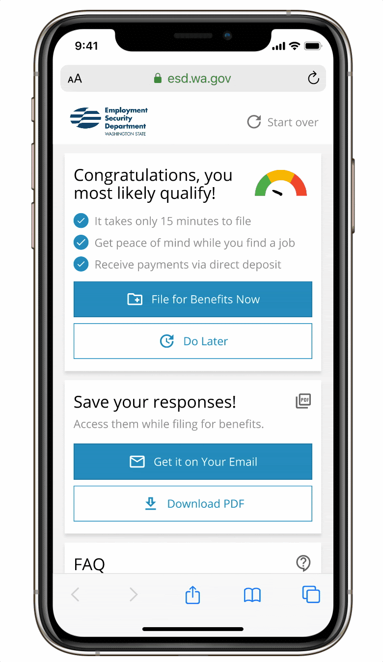
TLDR: The original design was a complicated PDF. We did a literature review, comparative analysis, stakeholder identification, cognitive walkthrough/task analysis, user interviews, empathy mapping and personas to research, empathize and define the problem. We used a journey map and scenarios as additional tools for research and ideation and then defined what success should look like. We built out three versions of low fidelity wireframes. Afterwards, we did user testing with CTA text variations, and card sorting. Iterated, landed on one design, built out a design language and brought it to a high fidelity prototype. Usability testing was done again, more iteration and voila!


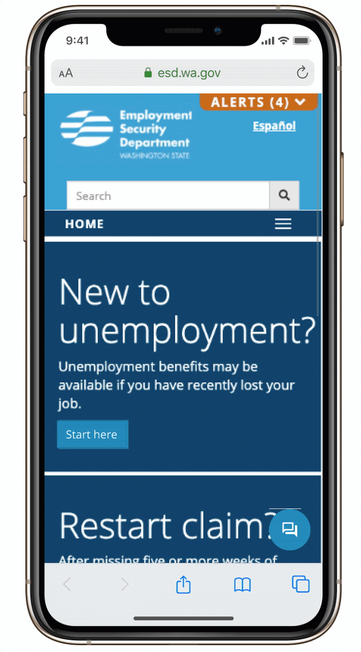
Original Design
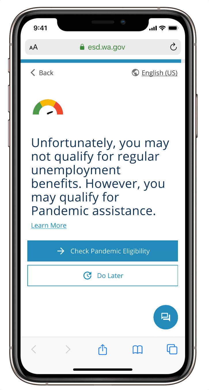
Updated
THE RESEARCH
Compiled research and testing insights for presentation on recommendations. Synopsis and outcome below.
THE PROBLEM
The current eligibility checker is unintuitive and the information provided is decentralized.
How might we design a digestible and digitized Washington State Unemployment eligibility form?
In the United States there are currently 12.6 million people facing unemployment (Bureau of Labor Statistics, 2020). The current unemployment rate can be attributed to the economic activity that has been curtailed by the COVID-19 pandemic (Bureau of Labor Statistics, 2020). To claim unemployment benefits in Washington State, individuals need to use the Washington State Employment Security website. The first step in this process is to check eligibility for unemployment by using a checklist.
With over 12 million Americans considered unemployed, it is imperative for us to digitize the experience so as to make it more accessible and scalable for the long term (Bureau of Labor Statistics, 2020). With a revamp, we are aiming to create an experience that is:
-
Streamlined: Provide personalized, digestible, discoverable, and actionable paths for evaluating eligibility.
-
Supportive: Provide people with help with questions when needed
-
Inclusive: Provide comprehensive support for people from diverse cultures and capabilities.
-
Encouraging: Evoke empathy and encouragement through visual design and text. Informing and encouraging people to submit the form even if they are unsure of their eligibility.
-
Accurate: Evoked user has to open a new tab and bounce off the website
-
Efficient: Save responses for future use and provide ability to download responses for future reference.
Process of Definition
-
Literature Review + Competitive Analysis: Analyze articles and government forms/checkers from other states to better understand the unemployment process and ensure that we match feature parity.
-
Surveys/Interviews: Conduct surveys and interviews with individuals who have applied for unemployment to deeply understand more about the process and pain points.
After literature review of research surrounding unemployment we pulled eligibility checkers from other states.
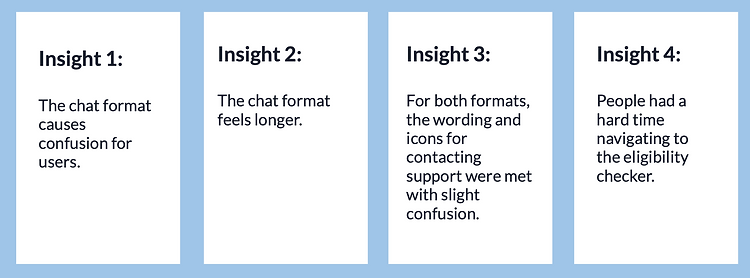
Key insights: Knowing what was covered and was not was helpful. Limited text made for better readability but more questions. Color association of red with no and green with yes helped to understand what cases would be eligible without unnecessary wording.

Competitive Analysis
IGIBILITY
UNDERSTANDING
THE USER


Stakeholders
-
Individuals facing unemployment in Washington State
-
All industries are being affected by COVID-19 with the most job losses in industries such as leisure/travel, construction, and retail trade. Many of these individuals are facing unemployment for the first time due to the pandemic and have not navigated this process before.
-
-
Family members and dependents of the unemployed
-
Government employees working on claims
-
Due to the lack of clarity around the eligibility criteria for receiving unemployment and the confusion surrounding the process, government employees are flooded with forms that are filed incorrectly or are filed by individuals who are not eligible.
-
-
Employers
-
Employers often act as a liaison between workers and the Unemployment Security Department.
-
Process of Understanding
-
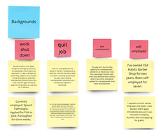
Surveys/Interviews: Conducted thirty surveys and seven interviews with individuals who have applied for unemployment to deeply understand more about the user.
-
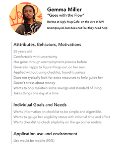
Empathy maps, Personas: Use information gained through surveys and interviews to create case specific personas and empathy maps to better understand the user.
-
Scenarios/use cases: Outline possible scenarios and use cases to ensure that our solution captures these perspectives.
-
Journey map: Outline the step-by-step interactions the user will interact with when using the form to uncover barriers and pain points.
-
Card sort and CTA text variations: Work with users to help identify a schema to categorize the eligibility questions.
-
Low-fidelity wireframes: Create low fidelity wireframes to receive stakeholder feedback and iterate quickly.
-
Usability Testing: To gather feedback, locate bottlenecks, and gauge interactions.
-
High-fidelity wireframes and prototype: Create high fidelity wireframes based on user feedback to represent the interactivity and visual aesthetics of our final solution.


Snapshot of Empathy Mapping
Empathy mapping and data from user interviews and surveys used to develop personas that represent three varying types of user stakeholders to draw from when attempting to meet needs through journey mapping and use cases.
Understanding
Success
The new design should:
-
Have a significantly higher task completion rate than the current system.
-
Allow a user to discover information about questions within the context of completing the form itself (instead of having to open a new tab).
-
Should have a System Usability Scale score of more than 90%.
-
Use accessible colors which qualify under the WCAG 2.0 guidelines for contrast accessibility.
-
Have the capability to be used in the two most popular languages of the state of Washington: English and Spanish.
-
Must have support features that are easily discoverable and visible.
-
Should have a frequently asked questions section
-
Encourage and remind users to submit their application even if they are unsure of their eligibility.
-
Allow a user to save their responses for future use
-
Allow a user to download their responses for future reference
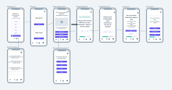
Wireframing
Using secondary research we started wire framing two versions. One conversational and one standard. We started on paper, then in low and mid fidelity with different iterations as we acquired more and more insight from interviews and usability testing.

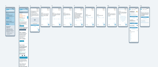

User
Testing
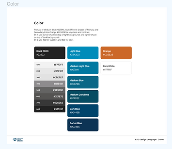
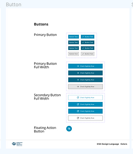
Design System
Standardized and created in Figma based on Washington State Unemployment's current WCAG 2.0 compliant system.

High Fidelity
Prototype
Final iteration meeting success metrics and usability standards culminated through testing.
Incorporated insight from research: Easily located and identifiable process outline with streamlined content.
Incorporated insight from research: Ability to find more information and get help without navigating away from page.
Incorporated insight from research: Most comprehensive question phrasing and order achieved using card sorting and CTA surveys in optimalworshop.com